
Photography can be a daunting prospect when you first pick up your new DSLR camera. So many buttons and dials to choose from? Where do you start? Why not let me teach you?
Like I said “Photography can be a daunting prospect when you first pick up your new DSLR camera”, so where do you start? The camera is mainly governed by three settings, Aperture, ISO and shutter speed. It’s the ability to balance these to make the correct exposure.

Rule of Thirds
What makes a good landscape photo? Well, there are many explanations out there like ,“the rule of thirds” and the “golden ratio”, to name just a few. These are the terms used to describe where you are putting your subject in the frame, making sure that your main subject is on one of the cross points like the example shown. Then to make the whole photograph more pleasing to the eye, you try to put something interesting in the foreground, the middle and in the background of the image. For example, if you look at the rule of thirds photo, the boat and refections are on the bottom third, the mist and the mountain is in the middle and the sky is in the background.
As shown in the rule of thirds photo, where should you position your horizon? Ideally, you should position it on one of the two horizontal lines running across the frame to create a more balanced photo. e.g. If you have a uninteresting or flat sky, then maybe think about putting your horizon point near the top horizontal line of the frame and vice versa, if you have amazing clouds at sunset but but a weaker foreground, you can then emphasise this by putting your horizon line in the lower third or the lower horizontal line. All of these rules to photography are there for a reason, to make your eye wander through the frame exploring the photo in more detail.

Rule of thirds Kissing Trees
Although I abide by these rules in some of my photography, I certainly don’t let them dictate the way I take my photograph. If you look at this photo, everything appears to be wrong, the horizon is in the centre on the photo as well as the main subject. Does that make this a bad photo? Well not really! I just wanted some symmetry while adding the leading line of the road which we will talk about in the next topic. This is the main reason why we shouldn’t just be governed by rules. If you studied every rule whilst composing your shot it would become a chore and somewhat unnatural.

Leading Lines
Onto the last main topic on composing the photo. Ideally you want a “foreground, middle ground and background” to create interest. So lets talk more on the foreground. That can be anything from a nice arrangement of flowers or some stones or pebbles leading out to the sea but my favourite is “Leading Lines”. These can be roads like the leading lines photo or patterns in the sand, or one of the most common is streams or rivers, anything that guides the viewers eye from the bottom of the photo through to your main subject as you can see from the photo on the right. In this photo, I had an idea of what I wanted to create. This is a long exposure of about 15 seconds to capture the lights of the moving cars coming up the hill, leading your eye through the beautiful vista of the Quiraing, on the Isle of Skye. Of course, leading lines can’t be found in every photo but it is something I always look out for.
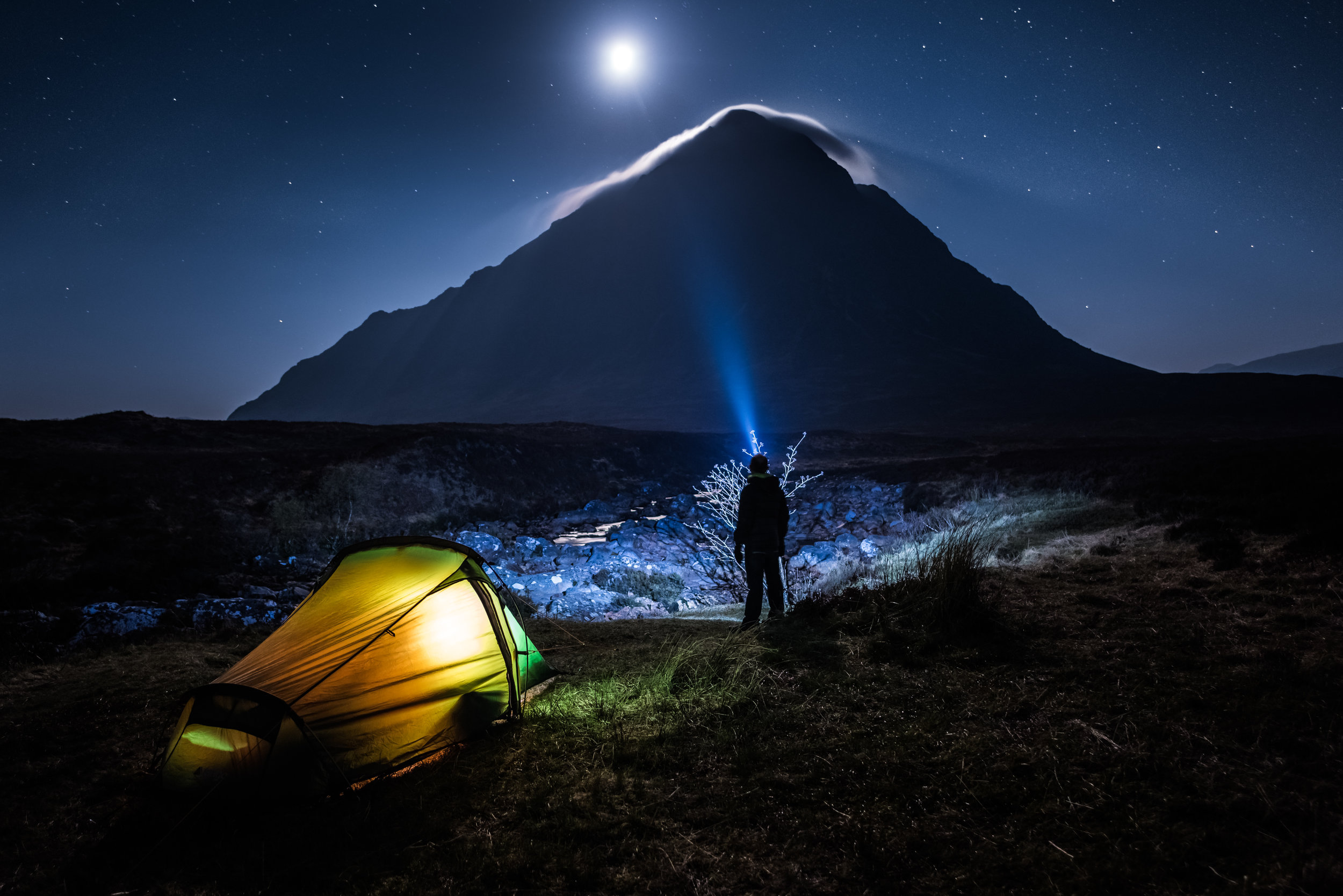
Camping at the Buaichaille Etive Mór
Foreground in a photo is generally missed out completely by the everyday photographer, or people just snapping away with there phone. Like I have said, you can literally add any form of of foreground you choose. If you are a camper, put your tent in as this is a great way to add interest as well as showing depth and scale. Foreground is much more important in your images if you favour wide angle lenses. It seems silly to mention it but, if I were to take this shot at 150-300mm isolating the moon and the peak of the mountain, the foreground then becomes the mountain, the middle ground then becomes the mist over the top and the background is the moon.
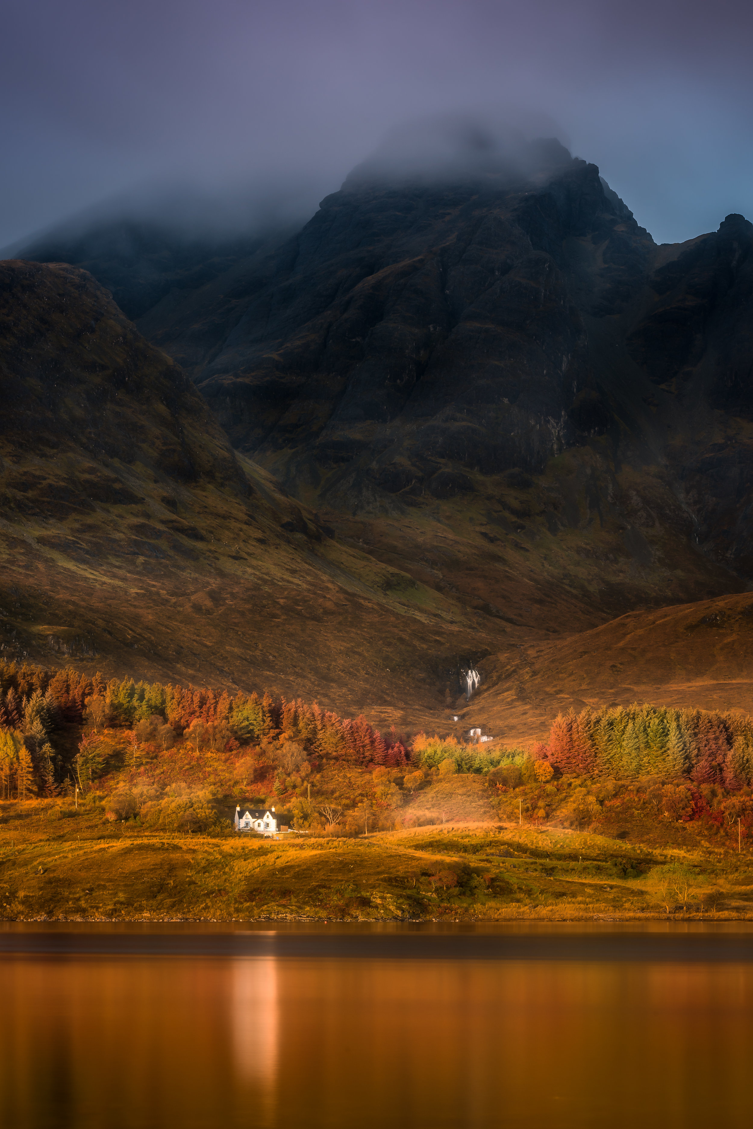
Loch Slapin, Isle of Skye
Landscape photos can be shot at all different focal lengths! Most people new to photography will typically try to get everything in the frame, and shoot with their widest angle lens. Although it seems like the correct thing to do, often photographers are missing out on the “real photo opportunity”. If your subject, for example, is a lighthouse but your closest vantage point is 500 yards away from it, 20mm focal length on your camera almost makes your main subject obsolete. Just try and experiment! Use various focal lengths “Fill the frame with what is important in your shot”. Sometimes, the simple shots are the ones you will treasure. Take this photo for example,It was taken at 135mm, if i were to shoot it 20mm, the little house below the Black Cuillin mountain would be totally lost in the frame. I was also trying to avoid all the distracting elements. There was lots of seaweed all over the loch and not really nice to look at even at 100mm so going in that extra 35mm eliminated all the unwanted elements.
My own personal views on teaching photography is very simple. Find an interesting subject and shoot it in the best light. You will find that will make a far better photo than if you followed the all the above rules, and took a photo of a boring subject with a grey sky.
That was a brief guide to the composition element of photography. So what else do we want to look out for when creating a photo. Colour and contrast is another, that is the main reason that sunrises and sunsets works so well, and are the best time to take a photo. Contrast can be explained in a couple of different ways, contrast in light and contrast in colour. As the sun approaches the horizon in the morning or dipping below at sunset, the light is beautifully balanced. There are very little harsh shadows through out your photo, where as, if you take the same shot at mid day when the sun is high in the sky, it creates long and dark shadows, it’s these harsh shadows (contrast) that you don’t want.

Colour Wheel
Contrast in colour is completely different, although it does have a similar result when shooting at sunrise or sunsets. Contrast in colour is combining two or more colours that go well together, e.g. have you ever heard of the saying that opposites attract? This is what exactly what it is! Think back to your childhood and the colour wheel, it’s the direct opposite on the chart that works so well in photos. So, if you are shooting a seascape at sunrise, you are hopefully getting a a lovely warm orange from the sky combined with a cooler blue from the water. As you can see from the wheel, they are direct opposites on the chart.

Cooler tones at Glencoe
There are other colours that work extremely well together. If you choose all warm colours among the shades, e.g. (reds-yellow) they will most definitely work even if all the shades are completely different.In this photo, it demonstrates all cooler tones. White is a neutral colour but if you look closely at the whites, there is strong blue cast throughout. You have the dark blue of the sky combined with a gradual decline of blue tint as the shadows get lighter.

Reflecting warm light on Glencoe
You might be thinking, we can’t control the colours in what we photograph but, it that isn’t necessarily true. If your photo is taken at sunrise/sunset, you are much more likely to have these tones without thinking about them. You may not realise it at the time but the warming sun reflects warm light throughout your photo. Greens almost turn a yellow or orange and the reflected light off the warm clouds can give an almost red tint to your overall photo. If you look at the image on the right, the light from the sunset is reflecting warm tones throughout the valley. The greens now have a yellow tinge and even the snow capped mountains have a warm glow.
I won’t write an in-depth explanation on camera settings as there are so many on the internet, but depending on your style of shooting, you are mostly going to choose Aperture priority mode. Aperture priority is basically, how much of the image you want in focus. F22 on your camera will give you the maximum depth of your subject in focus where as, F1.4 will be extremely shallow, meaning only what you have focused on will be sharp, the rest of the image will be much softer depending on how far away you are from your subject.
Most landscape images will be shot at between F8 - F16 as this is generally thought to be the sharpest settings for most lenses while giving the greatest DOF (depth of field). You may ask “why not just shoot everything at F22” and get everything in focus? At this aperture, it can cause what is called diffraction, again without much detail, it may cause unwanted fringing and banding to you photograph. Basically, you will get colour noise and distortion around edges of subjects. For example, if your shooting a castle at F22 and the sun is coming up, you often get a green/purple colouring around the edge of the castle, that is called fringing. Banding is where you get wave like motions in your image, particularly found in the sky.

ISO only really comes into play in Landscape Photography when you want to capture motion in lower light. I will try to explain this in a photograph I recently shot. ISO is how sensitive your camera is to light. Most landscape shots are shot at your lowest ISO setting, which is usually 100. The lower the ISO, the better the picture quality without the artificial grain or more commonly called noise. This is a sunrise shot and I wanted my aperture to be at F8 so I could have a sharp image all the way though the photo. The sky was very bright as you can see, so I had a 3 stop graduated filter meaning I was reducing the light in the sky by 3 stops of light on my camera making it similar to the foreground so I didn’t over expose any highlights. Everything is now balanced, the sky and the foreground are giving me the correct exposure but in aperture priority, the correct exposure time is 2 seconds. This would have made the water really flat and calm looking but I wanted the motion in the water. What can I do? I am at F8 in aperture priority and on my base ISO which on my camera is 64, which is saying my shutter speed is 2 seconds. To convey motion in the waves, I need to get my shutter speed to around 1/2 a second. I don’t want to change the aperture as I want it to be sharp, front to back. I can’t change the shutter speed as I am in aperture priority. The only thing left is to change the ISO to try an accomplish that 1/2 second exposure time I want. So 2 seconds to half a second is the equivalent of 5 stops of light 2sec, 1.6sec, 1.3sec, 1sec, 1.3sec, 1.6sec and then 1/2 a seconds which is 6 stops of light. So I increased the ISO the same, 64, 80, 100, 125, 160, and on to 200 which gave me that desired 1/2 a second.
The only reason I would change from aperture priority is in dark conditions or if you want to be creative using filters to create the desired effect you want. All of the above will be explained more concisely in person when we meet and though the day.
I hope that was easy to follow but, it is much easier in practical use. This is a quick re-cap of what’s been discussed.
Composition and what to look out for.
Rule of thirds and where to place your subject.
Create more depth using a foreground, middle ground and background.
Look for leading lines to draw the viewers eye through the photo.
Try alternative focal lengths.
A look at what colours go together.
A quick look at shutter speed using ISO.
I am very confident, you will be a far better photographer after our day